Overview
Klaar tracks performance management through real time AI-powered insights
Klaar helps with Performance Management through reviews, tracking OKRs, providing 1-on-1 sessions, Individual Development Plans and Engagement surveys, through which it aims to bridge the gap between expectations and performance. It is a powerhouse for Managers, HR and Employees to have a unified space for tracking performance.
User Problems
Tracking OKRs in a single page became challenging and reduced module engagement
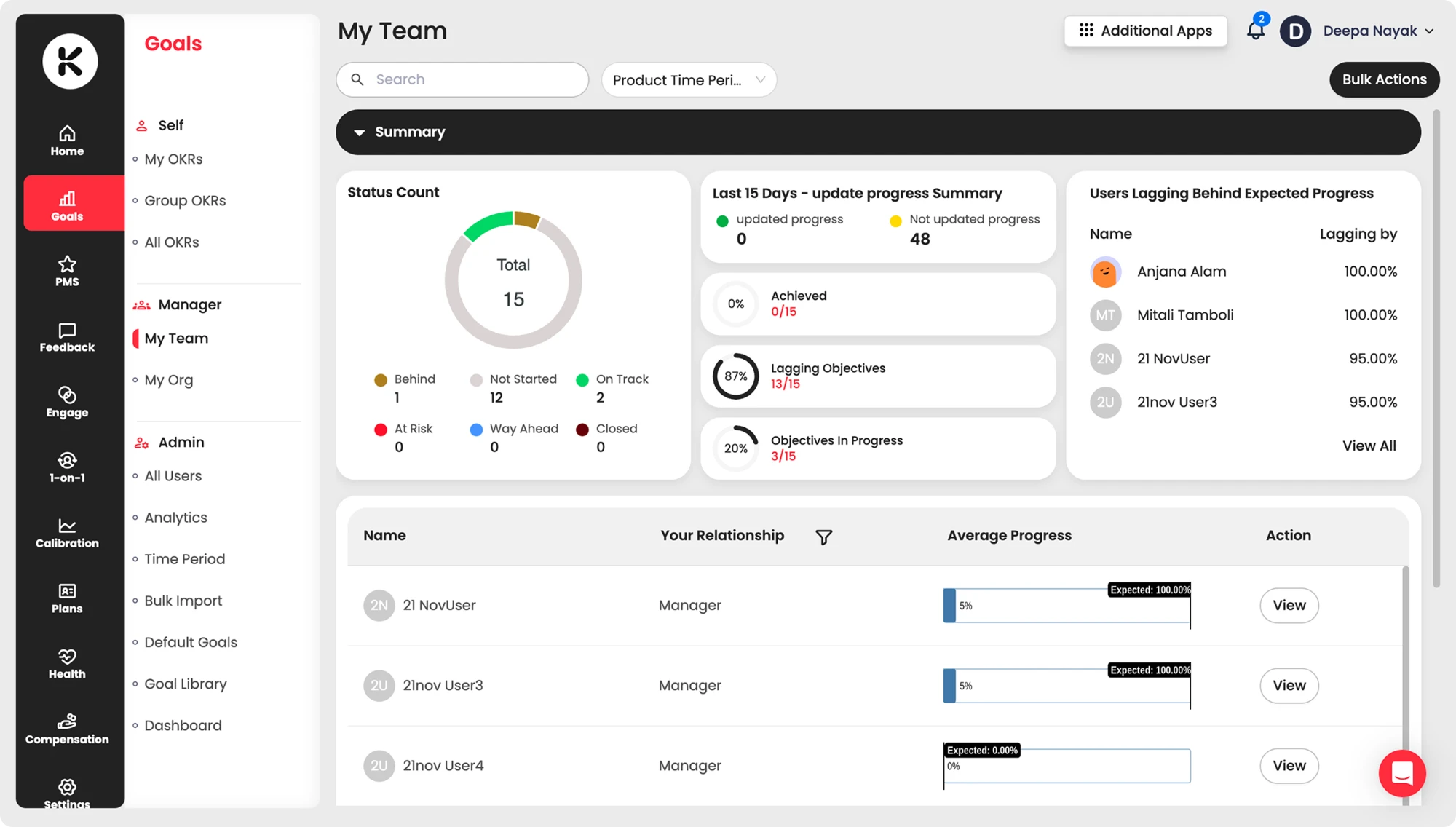
Managers had to keep switching context to view team goals or individual goals. Users lost context before they could use the product. This led to decreased engagement with the module.
The My Team tab showed individual team members’ goals and the My Team overview gave a glimpse of only the manager’s direct reports. This led to a continued dependency on the CS Team for understanding where to navigate to see a particular piece of information.
Goals
Introducing a clear Navigation Path to increase engagement and improve product experience
Improving retention for the OKR module was of primary importance, since this module is heavily used by Managers and Admins as well as individual employees for setting their objectives and achieving OKRs before performance reviews.
Problem Statement
How might we create a cohesive OKR dashboard that helps managers make faster, more informed decisions about support and prioritisation?
Before
After
Competitor Analysis
How other applications are showcasing data

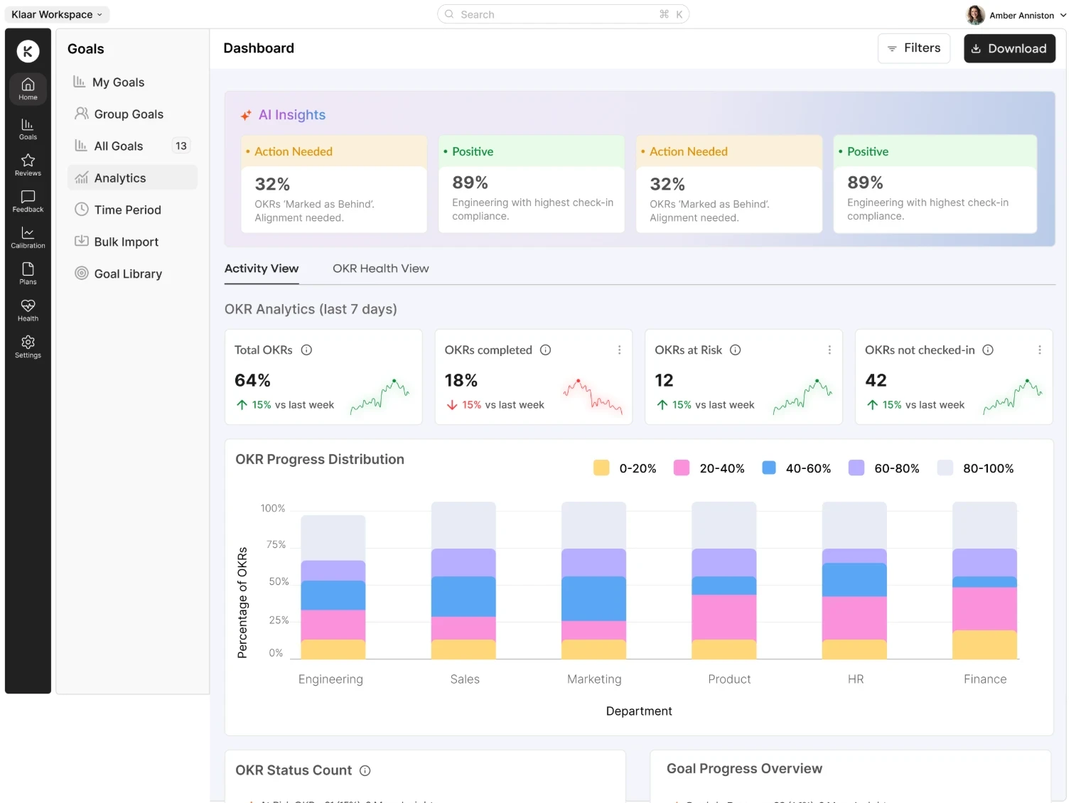
Clarity of showcasing data in cards reduces cognitive overload.

Segregation of different types of data into sections with clear legends.
Research Insights
HR Tech clients want clear, data driven dashboards, which reduce ambiguity and navigate them towards their goal without having to go through an entire module. Reducing friction points in the product helps in building trust.
Design Iterations
Building elements one at a time to test fast and ship faster
Clarity for Managers
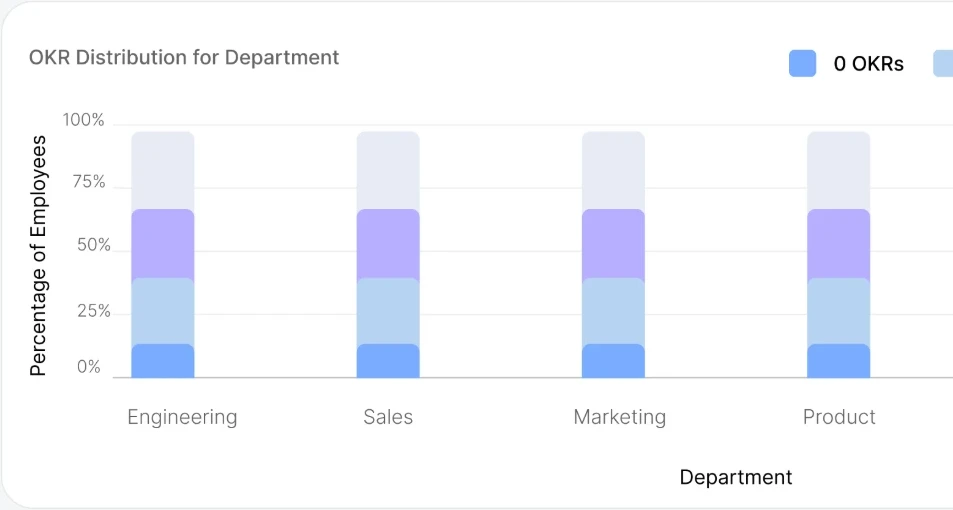
Data Visualisation improves alignment with team goals
Managers want clear, data driven dashboards, which reduce ambiguity and navigate them towards their team goals.
AI Insights for Quickview
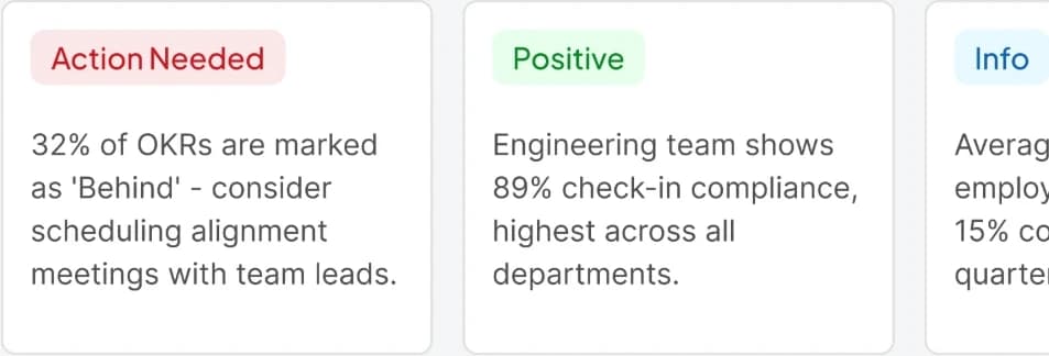
AI Summary keeps the entire org aware of their OKRs
Managers and employees are all aware of their OKRs and can keep a check on their lagging goals through these summaries.
Post Feedback
Refining designs after PM feedback
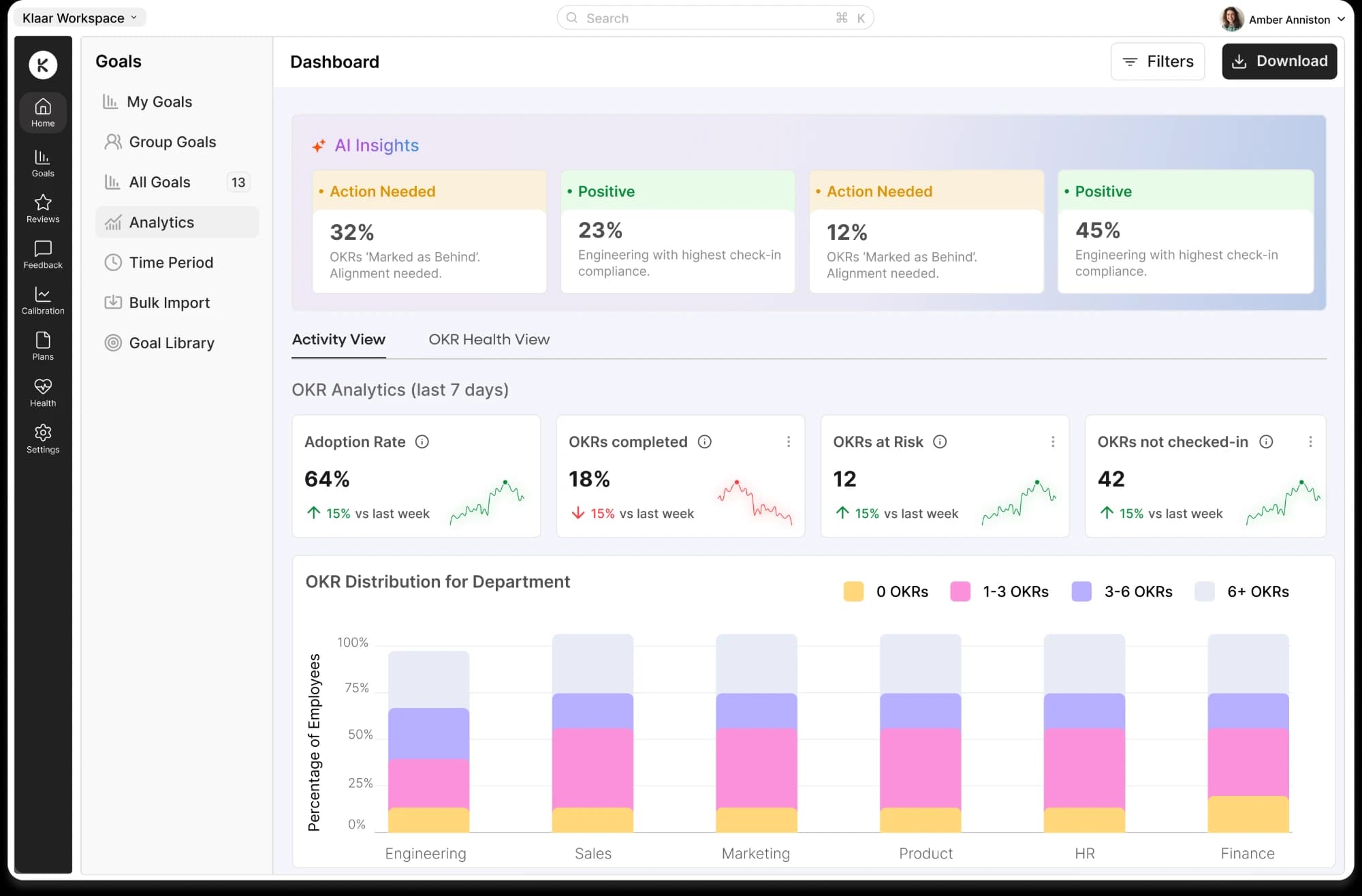
A departmental filter was needed to allow managers to check OKR activity in each department. We needed to change the colour scheme and experiment with a new set of colours to accentuate the analytics instead of the brighter current colour palette.
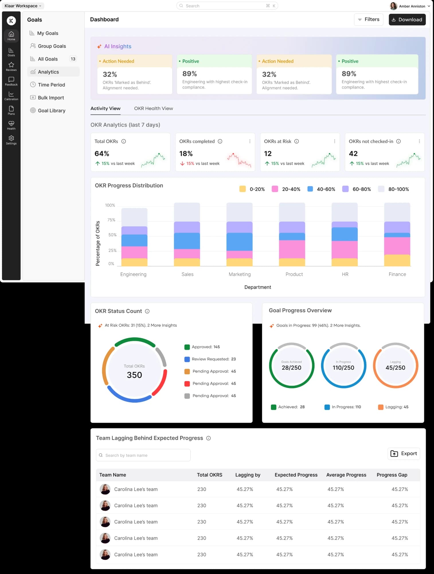
- Analytics Cards with graphs that indicate performance
- Multiple Donut charts with separate colours distinguish information
- Table highlighting teams lagging behind in progress gives a detailed report to the managers
Design Rationale
Why I chose the final design direction
01
Introduced AI insights for the overall analytics summary. Managers get a holistic overview of OKRs pending, delayed or progressed.
02
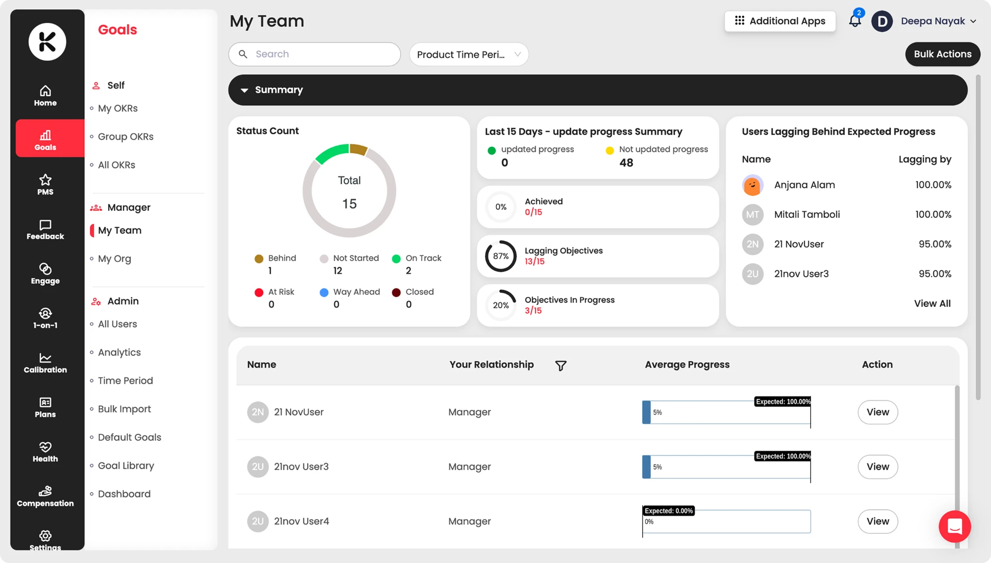
Teams lagging behind expected progress are given a column showing by how much, which informs managers of the gaps their reportees still need to close.
03
Progress overview is shown in 3 cards covering data across all parameters, keeping everything in a single view for ease of information.
Outcomes
User Feedback and Module Performance
Reduced Tickets
1CS Team reported fewer support tickets. Managers were able to get a clear overview of team goals.
Data in one View
2Managers could view data for all team members in a single view. No more tab switching.
Goal Tracking
3Insights improved goal tracking for managers, making it easy to keep track of their team’s progress.
My Learnings
Building a new analytics feature helped in solving a very critical pain point that had initially not been discovered
The biggest improvement was helping managers navigate to their team goals without too much context switching. A mere tab switch was their daily struggle.
Involving engineers early helped us discuss trade-offs before the build. For example, incorporating filters immediately would have slowed us down from implementing the rest of the dashboard, so we held the filter addition back from wave 1.