Overview
Why are Individual Plans Created?
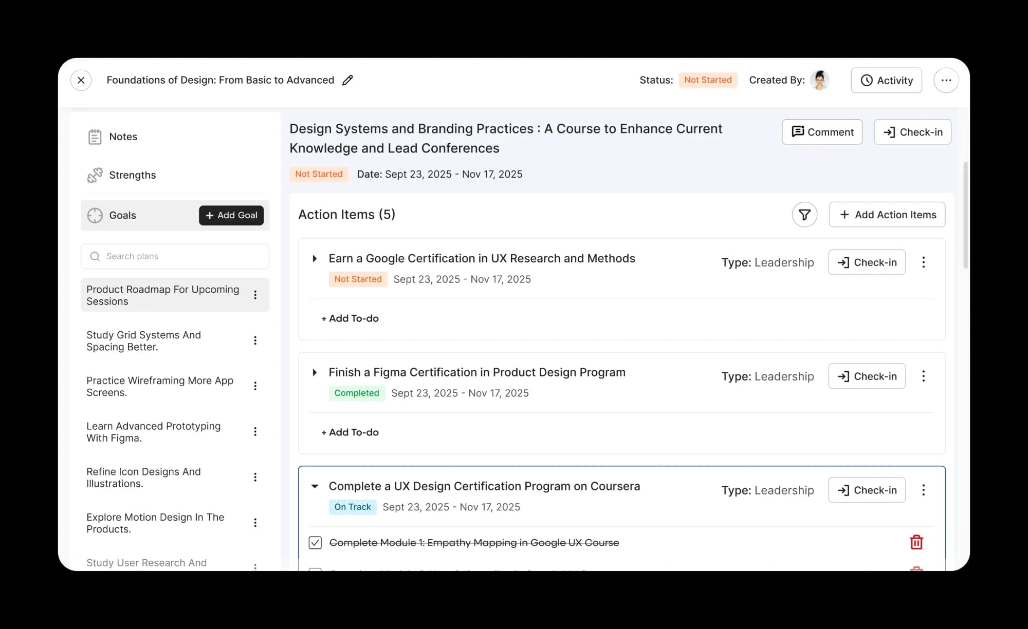
Individual Development Plans (IDPs) are created by employees or their managers to track performance. After creating plans, employees can create action items and mark them as complete once they achieve their goals.
User Problems
Unclear Navigation leading to incomplete progress in plans
After creating plans, we noticed a sudden reduction in the number of action items being created. Users reported feeling confused and unable to navigate the plans. The Customer Success team reported a rise in support tickets.
Goals
Reduction of Cognitive overload
We focused on improving the user experience by improving navigation and helping users understand the module, so that more plans would be completed. Incomplete plans were directly affecting OKRs as well, leading to performance concerns at year-end reviews.
Problem Statement
How might we design a better experience for users to help them navigate the module and complete their plans before the end date?
Proposed Solution
A complete redesign of the module starting from the entry point, simplified navigation inside the plan and a reduction of cognitive overload were proposed to increase engagement and regain trust among users.
Competitor Analysis
How other applications are showcasing data

Ready made competencies for development plans help employees plan their long term goals and behaviours.

Individual development plans get a separate introductory section which captures the user’s entire profile, mapping their interests and career progression.
Research Insights
When managers create these plans for their reportees, it is imperative for them to be completed. Action items in plans can directly lead to improvement goals. When employees are able to plan their long term goals, outcomes are bound to be better.
Design Iterations
Creating variations to detect what patterns users may prefer
Displaying sections
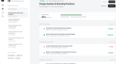
Progress Made Visible through automatic updates in module
Plan completion data shown upfront helps users understand their progress over the course of the plan.
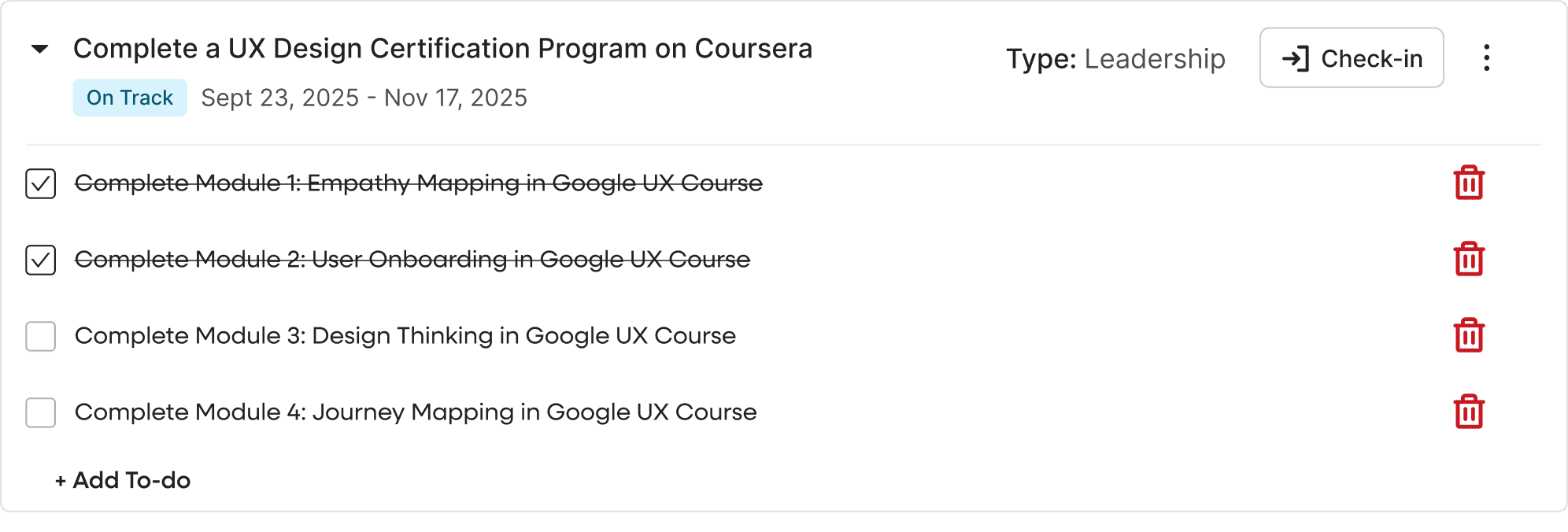
Adding To-dos made easier
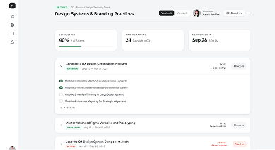
Adding Tasks and removing them made simpler
Users can now add and delete tasks and understand interactions on the page, without having to wait for a refresh.
Design Refinements
Final Screens after feedback from Leadership & CS
A departmental filter was needed to allow managers to check OKR activity in each department. We needed to change the colour scheme and experiment with a new set of colours to accentuate the analytics instead of the brighter current colour palette.
Consolidated Table → Focused View
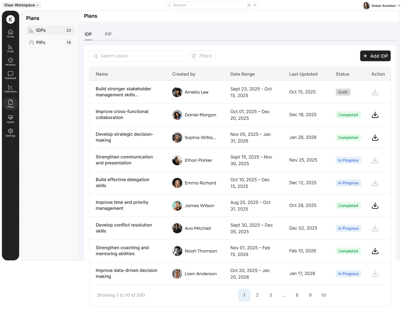
Improved Navigation → Increased Module Usage
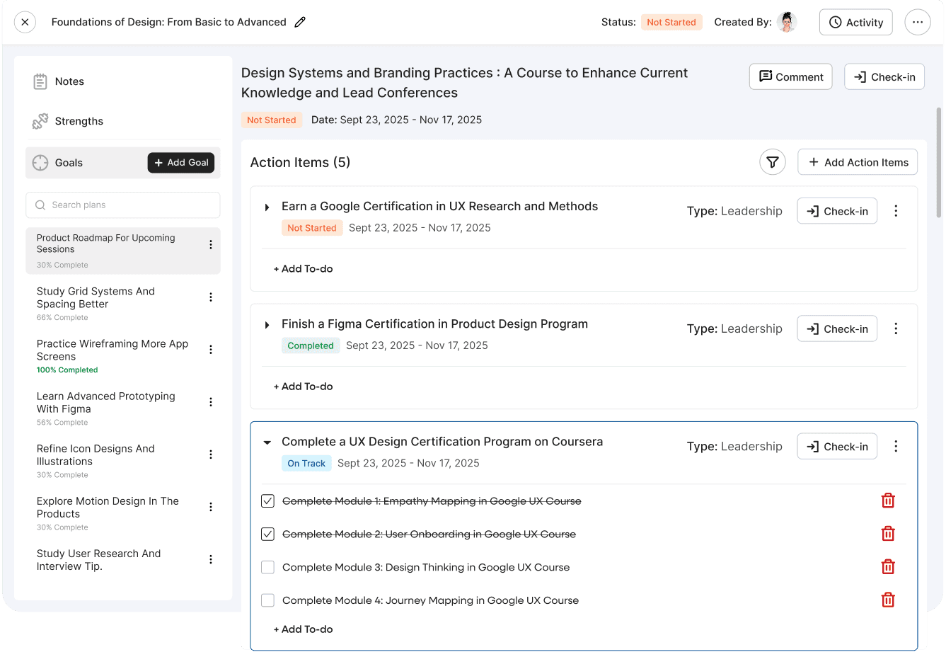
Design Rationale
Why I chose an entirely different view?
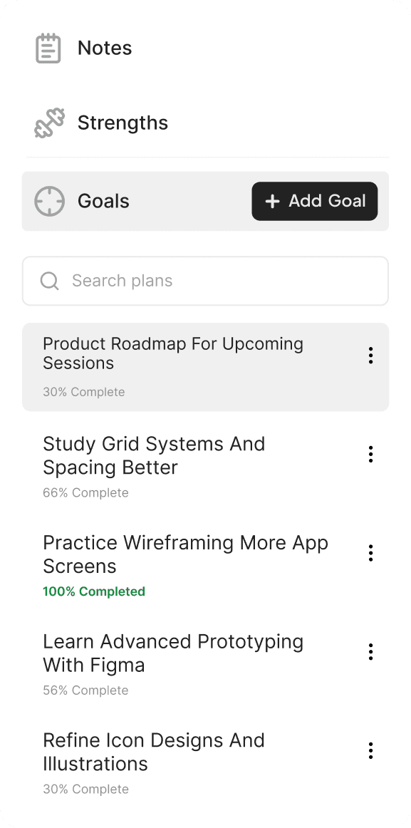
Progress View on Development Plans for Employees and Managers
Both employees and managers benefit from the rate of completion of plans. It informs both parties about progress and the next course of action.
Adding To-Do Made Easier
I built the experience of adding to-dos to action items. What was a broken action earlier was fixed in the current version. Users could now easily add to-dos and edit them in-line.
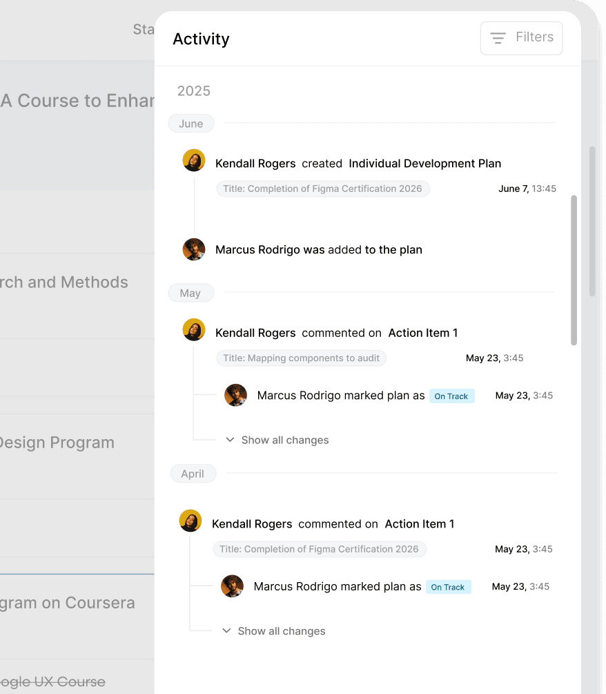
Activity View Revamped
Managers and employees can now view activity on plans and action items through filters, and keep track of events in the activity log.
Outcomes
In the first 2 months after launch, we saw a significant increase in usage of the module. Here’s a quick glance at the improvements.
Reduced Cognitive Effort
Users no longer felt confused by navigation or overwhelmed by information while using the module. Their sole focus was completing their plans.
Support Tickets dropped by 25%
Tickets for this module dropped significantly as more and more customers reported ease of use while signing up for IDPs. This was a moment of success for us.
Learnings
Best business outcomes result from reducing cognitive overload and regaining the trust of users. We gave them an interface that guided them.
- Creating impact comes from understanding the exact pain points of users and the business. Cutting down on elements improved visuals.
- Reducing friction points and improving navigation paved the path for creating a module users trust.