Overview
Rationale for Choosing Big Basket
As a frequent user of Big Basket, there were areas that I could not ignore based on my experience. After more than 6–8 months of observing these patterns, I decided to conduct research and understand the concerns of users.
Broken Trust
1Items are often missing from orders due to lack of supply, but users only find out when the order arrives at their doorstep. This harbours distrust among customers.
Delayed Delivery
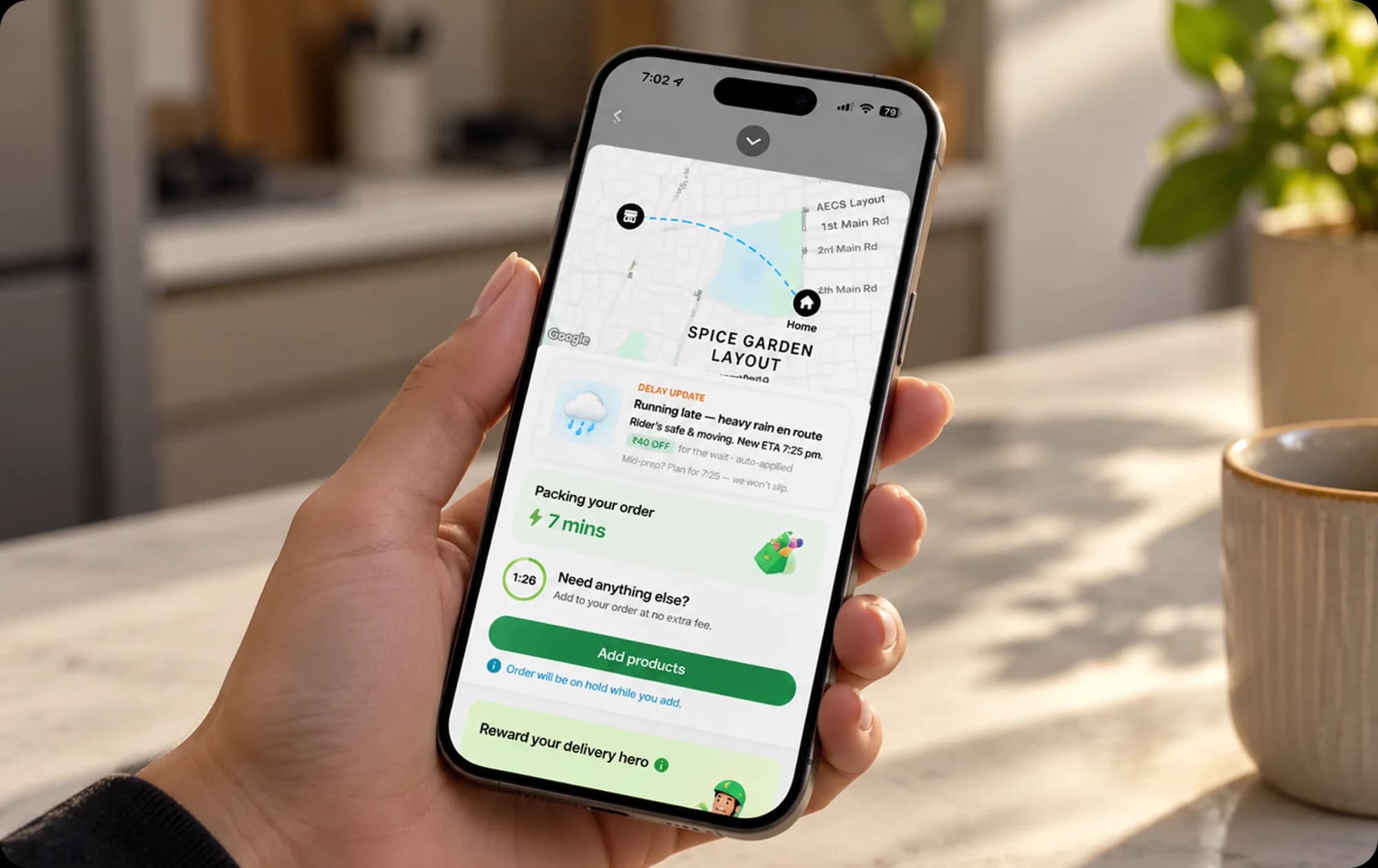
2Big Basket promises 10 minute delivery, yet orders are often late by more than 20 minutes with no prior information. This creates a lack of clarity in communication.
Research
Understanding the users
I conducted user interviews with customers of Big Basket to directly understand the problems they were facing. This would help me set a direction for my design and solve the existing friction points.
Problem 1
Item Availability not transparent
SCSanjan Chadha
“Nowadays we no longer receive a clear message saying that items are not available. We keep waiting for orders, but on delivery we are informed that it is not available.”
Problem 2
Delay in delivery not clear
KBKinjal B
“BigBasket is usually late to deliver these days, even if they promise a 10 minute delivery. I often have difficulty planning my meals, so I shift to other apps like Swiggy and Zepto for quick delivery.”
Problem 3
Support is hard to reach
SRSonia R
“My experience with refunds has not been satisfactory. I get refunds in the wallet, but sometimes need to order things on other apps. Reaching support is not easy at all.”
Competitor Analysis
How other applications are showcasing data

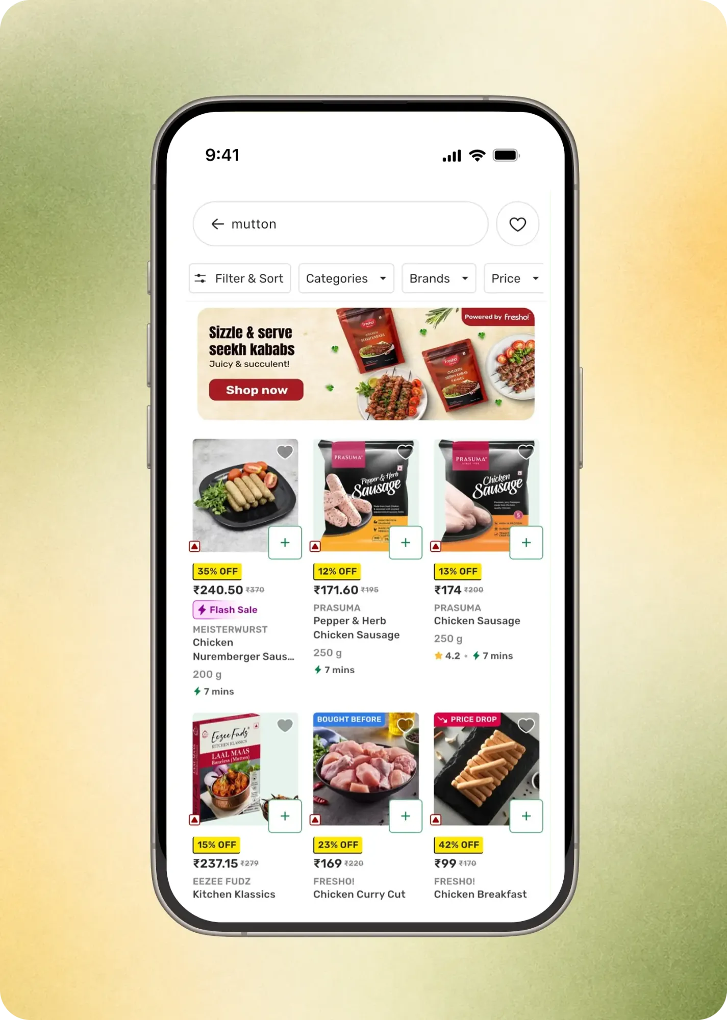
Items that are unavailable are clearly mentioned during search, so users know which items are out of stock.

Items can be substituted in case the original items are unavailable.

Item stock is updated immediately, with the number of items remaining highlighted. The exact delivery time is shown in the app and orders arrive within it.
Iterations
Explorations to Finalise the Solution
Final Designs
Designing for each pain point
1
Transparency in Availability
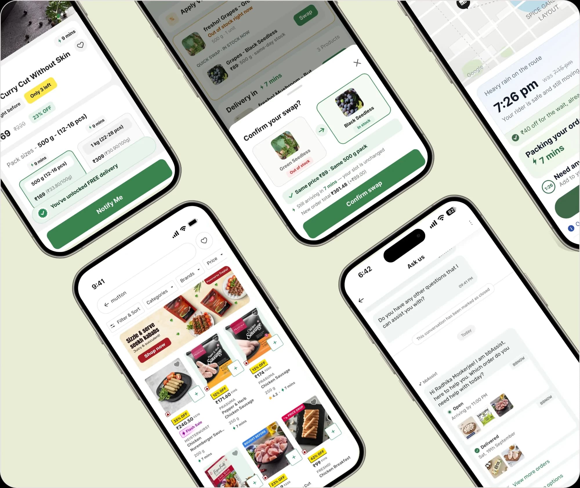
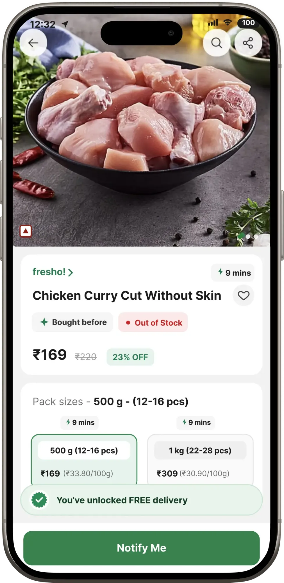
Out-of-stock items are flagged on the product page before checkout, with a similar item suggested as a swap, so users never discover missing items at their doorstep.
2
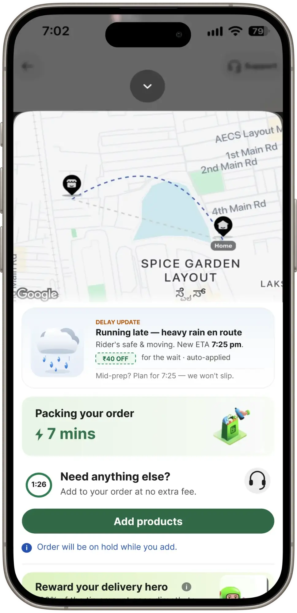
Clarity on Delivery Time
Live delivery estimates and a clear reason for any delay tell users exactly when their order will arrive.
3
Support Within Reach
Help is one tap away from the order screen, instead of being buried inside account settings.
Design Constraints
Overcoming challenges and building improvements
01
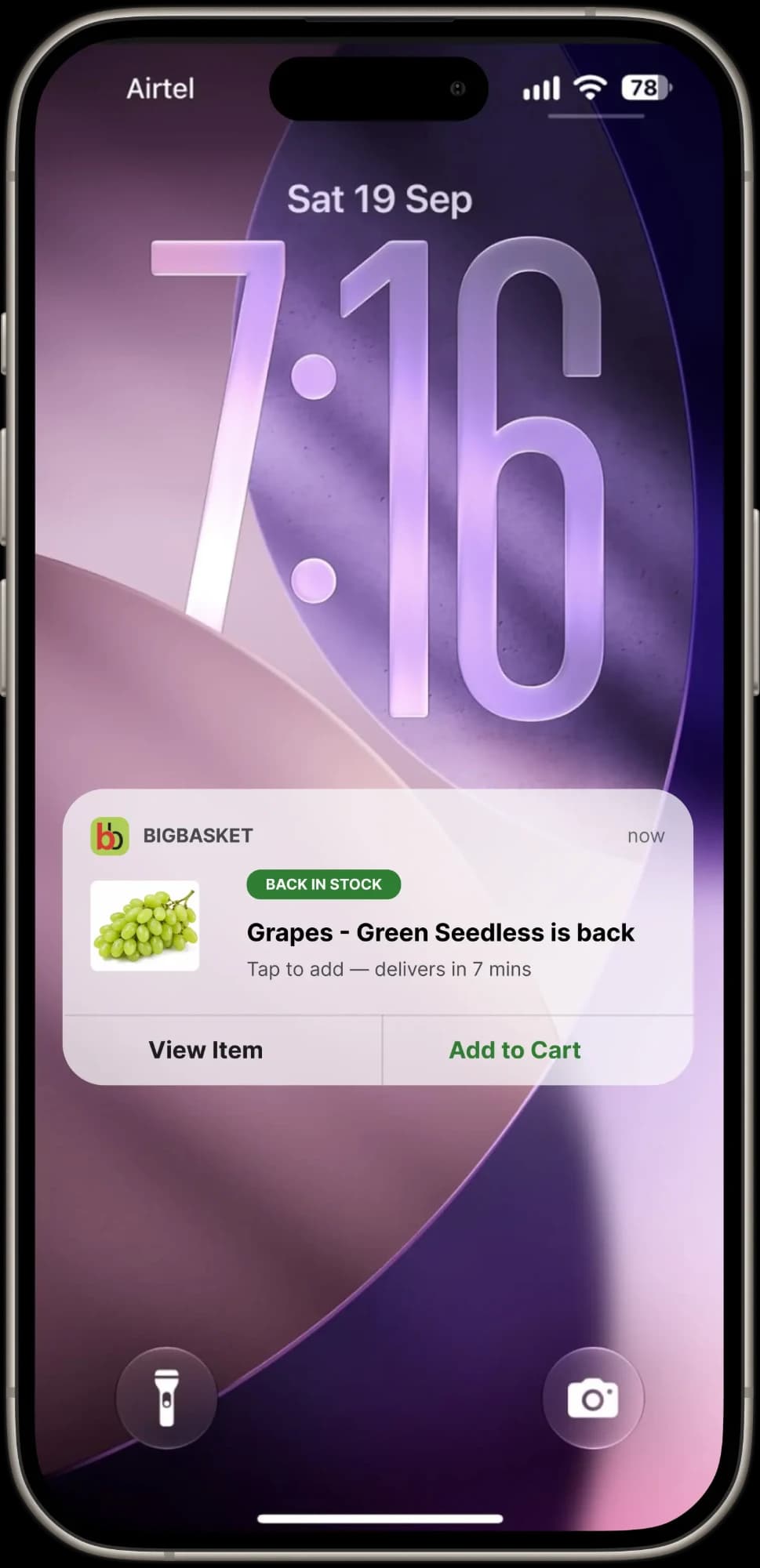
Inventory updates are delayed. Though this is a business issue, it means a poor product experience, so I designed for live stock updates that keep users informed about availability.
02
Users often don’t get their orders on time, and there is no communication from the app itself. I added a note under the delivery time explaining the cause of the delay, with a way to reach support.
03
Users should be able to locate the support screens easily.
Usability Testing
Validation from Users helped in mapping progress
I tested the interactions with colleagues and friends to check if all pain points were covered by the designs. If any had been missed, they would become clear from the prototype that I created using Claude.
User Satisfaction with Product
A complete prototype showed how the interactions improved the experience of using the app, and solved the issues that made several users switch to other apps.
Outcomes & Reflections
New Design improved user experience
After a successful round of user testing, I can conclude that the experience has improved by a significant margin. These improvements will reduce the back and forth between support and customers, and reassure users about when their order will arrive.
Rate of item returns and user frustration drops
When items go out of stock they are updated immediately, and users get an option to swap them for similar items in the inventory. This assures users of exactly what arrives at their doorstep, and has the potential to significantly reduce the hassle of refunds, cashbacks and returns.
Delivery time made clear
In case of delays, users are told why and when to expect their order, instead of being left waiting without an update.
Navigation to Support made Easier
Users looking for help reported spending far less time finding support.
Concept → Shipping
Metrics I would track if this project shipped
- Do users come back to the app after their orders have been delayed?
- Is there a drop-off when users are ordering something and the app has communicated the reason?
- Support request closure: are tickets being closed promptly, and has discoverability of support gone up?
- Retention: have users actually started to sign up and place at least 2 orders in 14 days?